

Something I Had to Learn the Hard Way When I First Started Designing
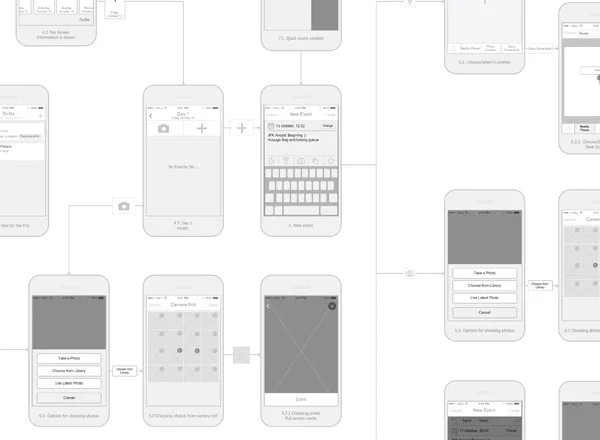
When I first started out designing, I would get so excited to make the app beautiful that I would skip making the low fidelity wireframes, and instead, start making high-fidelity wireframes on Sketch. I wanted to create the backgrounds, choose the fonts, the colors, and the icons instead of drawing with pen and paper. I wanted to use color instead of a grayscale wireframe. This created a number of problems. One being that it was hard to make changes after getting feedback. It even discouraged feedback because it didn’t seem like a work in progress. When I would run user tests, I would be too focused on what kind of aesthetic they liked versus how simple and comprehensive my flow was. Another problem was it complicated complex interactions like search results, check-out flows, or menu interactions because I was too focused on what it would look like, not what it would do. I needed people to quickly understand the objective, not think the colors worked well together. Eventually, I had to completely scratch what I had made and start over because it was just too complex and I wanted to change the style of the whole app.
Now I know how important it is to make rapid prototypes. UX design is a process, and if you don’t follow that process, you are going to suffer the consequences. The point of making rapid prototypes is to mock up the future state of the system. They are created to get early feedback with iterations from multiple insights. It’s good to show to developers so you can make an agreement of what’s possible and what isn’t. One of my instructors in Toronto always said test early and often. You start with pen and paper to pitch the concept. You create user stories to figure out the different uses for the same software. Next, you make grayscale wireframes to make sure the needs of the user are met. Does it create any stress? Are the steps logically arranged? Is the navigation clear and intuitive? This is what is most important to figure out during this stage.
Finally, you can move on to the high fidelity wireframes. This stage should closely resemble the finished project. It’s important to keep accessibility in mind. Which colors are harsh on the eyes and which aren’t? Could someone who is colorblind easily navigate your app or website? How are you creating and using visual hierarchy? Now you can make it look elegant and beautiful. Now you can ask the user to critique the aesthetic instead of the strategy and flow. This is my favorite stage of designing, but the journey to get to this point is strenuous for a reason. It prevents mistakes, betters your flow, and improves user testing along the way.
I’m glad I’ve finally figured out the relevance of following a process instead of trying to skip ahead. I’ve created better designs after learning this lesson and prevented mistakes that would have cost me way too much time.
If you want an expanded explanation of this topic, here is the article I read to inspire this post. I've been refreshing my UX skills with a free online course called HackDesign. Check it out if you want to learn about UX and UI design!